BEA CHEUNG
ARTWORK PRODUCTION,
DESIGN & ILLUSTRATION
Backed with strong artwork production and prepress technical experience, I specialize in developing creative and sustainable packaging solutions for consumer packaged goods. My work ranges from beauty and personal care products to alcoholic beverages and other brand identities.

CLIENTS
About Bea (she/her)
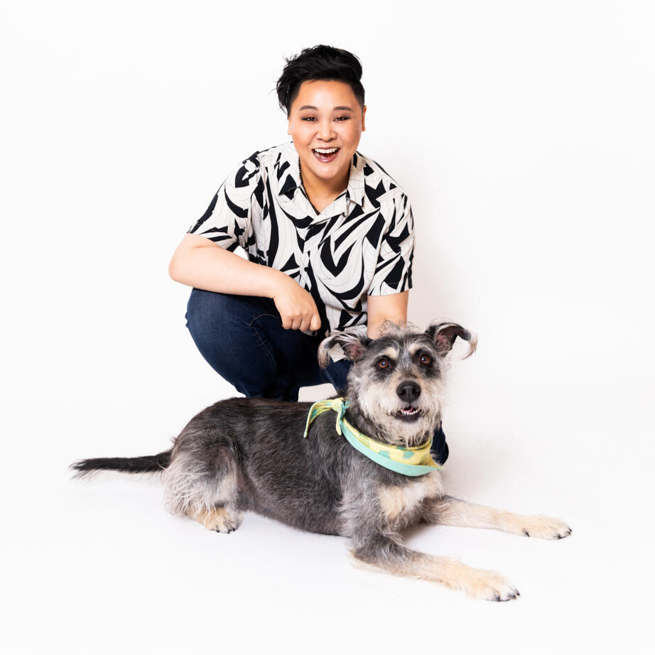
The perfect cocktail of creativity and functionality—my curiosity sparks when a tactile experience leaves a lasting impression. I value contributing to community to empower others to live authentically and embrace intersectionality through education. My artistic expression thrives at the cross-section of my LGBTQ+ and AAPI identity and is heavily influenced by drag culture, neon signage, enamel pins and arcade aesthetics. Unplugging involves a lofi or 80’s mix, cooking and gardening with my dog, Summer.Photo by Sarah Deragon. All rights reserved.
SELECTED FEATURES: You'll see a familiar face in the 2019 Morphe PRIDE Live in Color Collection campaign... It’s not everyday that I get to take up space to share my personal story and promote more queer Asian American representation in the beauty industry!
Out Magazine | Tutorial
Recommendations
“Bea brought incredible energy, passion and dedication to work everyday. In addition to her role as a Brand Designer, Bea spearheaded the company’s first-ever Pride Campaign - she executed the marketing communications, developed a partnership and charitable donation to The LGBT Asylum Project and organized an internal webinar to educate the team on the nonprofit’s mission and impact. Bea was also closely involved in shaping the direction and strategy of DEI initiatives and made a lasting impact during her time with the company.” — M. Li, VP of Marketing“She is truly dedicated to her craft and always put in 110% to make sure each project was the best it could be. In the time that I worked with her, she helped to support the team, built strong relationships and streamlined processes. Bea has so much technical skill + knowledge, I could always trust her to find a way to make IT happen; whatever it was, she was on it. Still she looked for ways to grow, educated herself to stay up to speed in the industry. It was a complete joy to work with her and I know she will only continue to get better!” — J. Cotto, Packaging & Art Director“Bea shared her talents as a package designer and artist with young folks at the Sonoma Community Center through classes and camps for teens. Her lesson plans were extremely professional and well thought out. She was able to convey ideas in succinct and efficient ways while letting them have full creative freedom with the projects. Being able to adapt to each kid's needs is an unique quality that she possesses; the students have been extremely lucky to be able to learn from and connect with Bea." — L. Bakkar, Youth Program Director
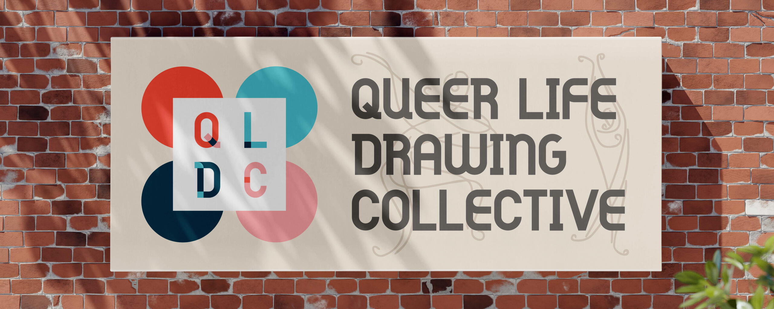
I founded the Queer Life Drawing Collective (QLDC), a monthly figure drawing practice to honor and celebrate queer bodies and creative community in the North Bay. My passion to use art as a tool for empowerment and community building was the purpose for forming the group. Contact me for more information!
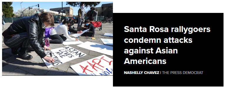
PRESS: The Press Democrat, a local newspaper published and circulated in the San Francisco North Bay, interviewed me at a local rally to speak about finding support within a small town community during a time of increased hate crimes against Asian Americans & Pacific Islanders. Read More
case studies
FALL 2022 - PLUMP UP THE VOLUME.

MISSION - JVN reimagined the traditional mousse with a volumizing foam for styling bigger, fuller hair. The challenge was to develop a custom-tooled aluminum primary that was compatible with the propellant, aerosol-free formula and a pump made with post-consumer recycled plastic properties.OUTCOME - I designed the bottle with many restrictions already on the table; it had to fit on narrow store shelves, be an exact diameter for a positive user experience and coexist with the teal Embody line. After rounds of prototyping, color swatching and press trials (along with troubleshooting many other obstacles), positive customer reviews came ringing in the new year.IMPACT - Along with working behind the scenes on the product, I was selected as a model to represent color-treated East Asian hair. You can find me on various displays in Sephora, Selfridges and other global retailers. My contributions to our sustainable and responsible packaging helped the brand retain our spot in Sephora's "Clean + Planet Positive" products collection.SERVICES - Product Industrial Design, Sustainable Packaging Engineering, Print Production, 3D Prototyping, Print Quality Control & AssurancePRESS - Sephora.com | JVNHair.com | Kohl's.com | Amazon
SUMMER 2021 - INSPIRE PRIDE. SHOW YOUR LOVE.

MISSION - Native Deodorant understood the backlash of "rainbow washing" as more competitive brands jumped onboard the Pride train and this presented an opportunity for me to lead the creative direction, but most importantly, give back to a LGBTQ+ non-profit in the local San Francisco community.OUTCOME - Leading first with brand authenticity, I developed a soft, soothing, empathetic approach to the existing bright, clean and minimalist design structure without using literal ROYGBIV swatches. Furthering this in the artwork development of the landing page, marketing activations and a creative toolkit that aligns with this aesthetic, I also sourced and managed the partnership with The LGBT Asylum Project and featured them on our social channels.IMPACT - We incentivized customers to donate and support LGBTQ+ organizations that directly benefit their local/regional communities and exceeded our initial targeted goal. At the end of July, we closed at about $2000 worth of donations to 50 different LGBTQ+ organizations across the US and a few in Canada and the UK! Because of this success, we were able to double our corporate donation to LGBTAP along with providing product donations for Pride events to three additional local nonprofits in the Bay Area.SERVICES - Creative Direction, Graphic Asset Creation, Web Design, Illustration, Color & Composition, Marketing Strategic Planning, Internal Training, Relationship-BuildingPRESS - Post From Founder, Okan Sengun | USAToday | Donate to The LGBT Asylum Project | Drip - 7 of the Best Pride Month Email Examples We've Seen
HOLIDAY 2021 - GIFTS TO SNIFF. JOY TO YOUR PITS.

MISSION - Native Deodorant envisioned Holiday 2021 to be the whimsical luxury collection that consumers deserved after a year of lockdown.OUTCOME - I illustrated the icons for each of the scents and explored colors that complemented each other and communicated the same relationship across different surfaces (plastic canister, metallic label wrap and paper tube). Once we hit production for the core packaging, I collaborated with an external creative partner to execute our stunning endcap displays.IMPACT - Expanding from 8 to 23 SKUs including new development for the Hair Care category, we went from ideation to launch in under one year! Even with strained overseas shipping lead times, we delivered over 1700 endcaps to various Target doors in the US.SERVICES - Illustration, Color & Composition, Packaging Design, Print Production, Visual Merchandising Mechanical ProductionPRESS - Holiday Scents - Shop Native
HOLIDAY 2019 - ELECTRIC NIGHTS ARE HERE.

MISSION - Morphe Brushes took holiday parties to another level with neons and shimmers within a full 60-piece collection that launched in November 2019.OUTCOME - I partnered with our Senior Packaging Designer to concept how bokeh photography and that dazzling effect to the eye could be elevated. After many rounds of troubleshooting and execution obstacles, we landed on a combination of holographic foils, digital prints on mylar and metallic inks on shrink sleeve material. The PR Mailer was super oversized to ensure it would fit all the products and provide ample protection and was accompanied by a beautiful saddle-stitched booklet with foil stamping.IMPACT - The 39L Hit The Lights eyeshadow palette was Morphe's first (and largest) artist-curated product ever executed with limited edition custom decoration. The success of the largest collection to date relied on my close collaboration with numerous international vendors to press check and quality control for consistency. Insights within our marketing channels predicted correctly that this collection was more highly anticipated than our influencer collaborations.SERVICES - Packaging Artwork Production and Mechanical Execution, Color & Composition, Packaging Structural Design, Prepress Production Management, International Press CheckingPRESS - Unboxing Review - xThuyLe YouTube Channel
This work is licensed under a Creative Commons Attribution-NonCommercial-NoDerivatives 4.0 International License.© Bea Cheung, 2024. All Rights Reserved.